Corrections Ink
Corrections Ink needed a logo that said everything immediately and concisely—which, given their business, felt like the only appropriate standard to meet. The mark needed to feel professional without being cold, approachable without being inappropriately friendly, and flexible enough to accommodate a shifting client base and the occasional partner brought on when workloads increased. It also needed to reflect the genuine, integrity-driven people behind the work.
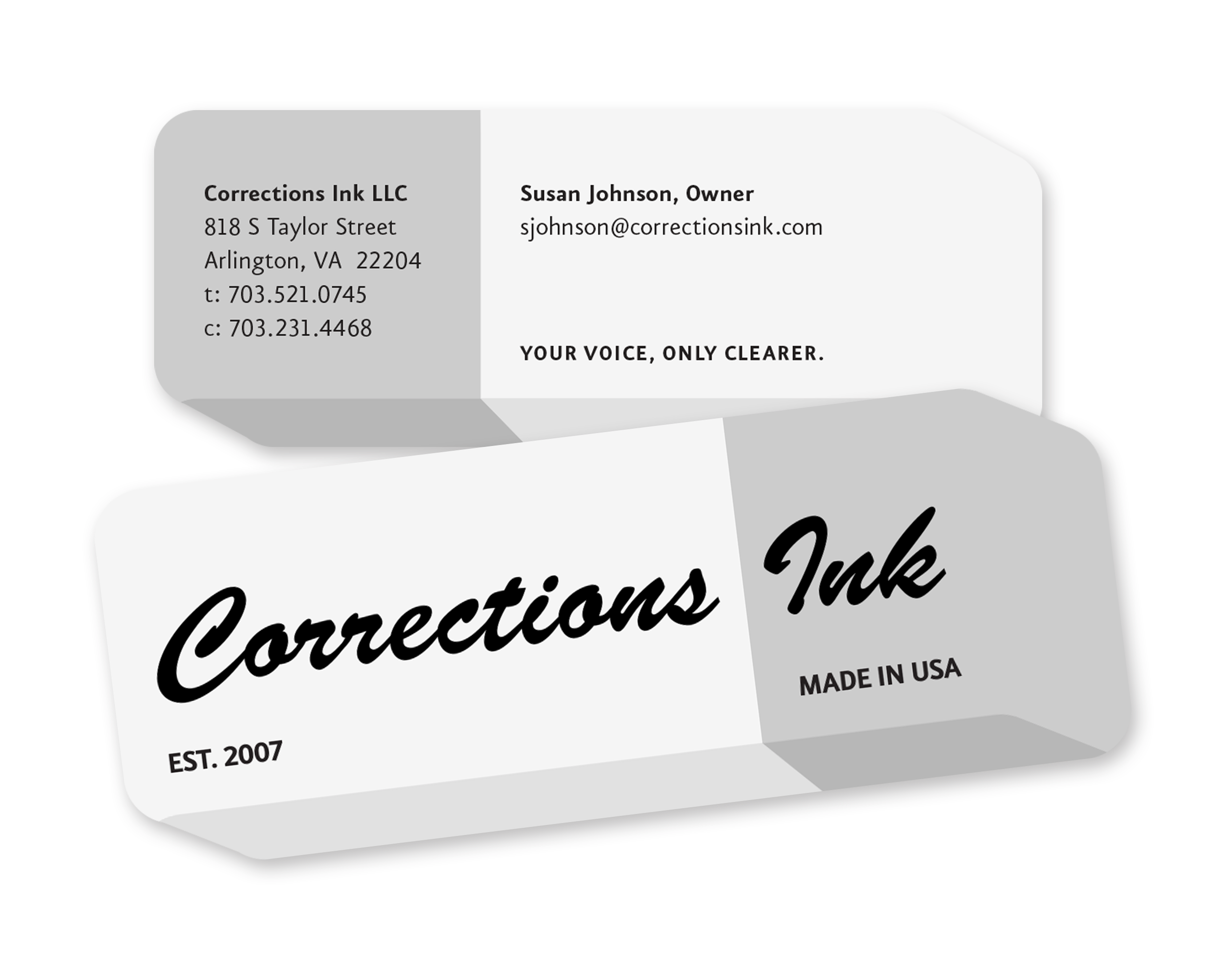
The solution was a retro-styled mark based on the familiar shape and color of a dual eraser. From there, a die-cut business card in the same shape let the logo occupy the entire front while the owners' contact information lived on the back. Corrections Ink got to show their wit—succinctly.