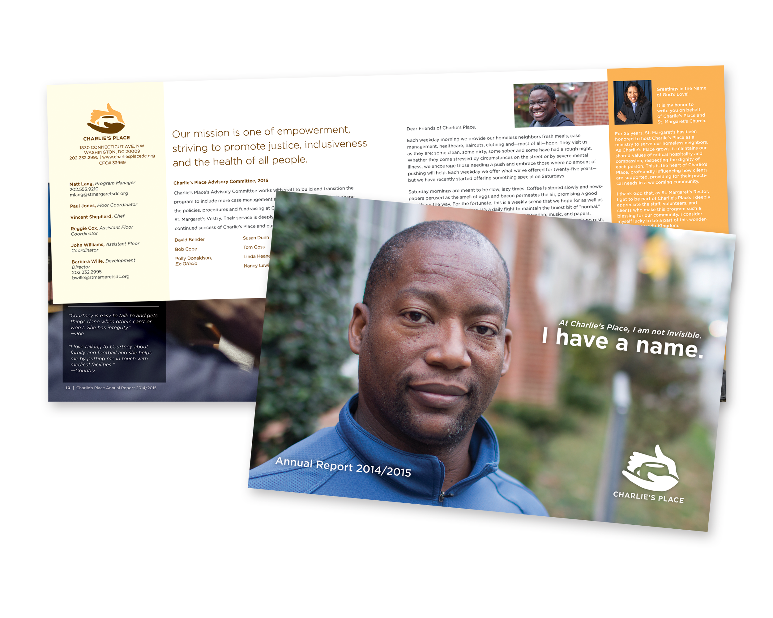
Charlie’s Place
Think about this the next time you’re standing in line with a bunch of surly strangers waiting for their Iced, Half Caff, Ristretto, Venti, 4-pump, Sugar Free, Cinnamon Dolce Soy Skinny Latte: sharing a “simple” cup of coffee allows for connection on a surprisingly profound level.
Coffee transcends class, race, creed, and sexual orientation, and the cradled mug in the Charlie's Place logo is light years away from huffy hipsters in tight pants. Instead, the mark evokes the sense of community a hot breakfast brings to Charlie's Place members each morning.
With a predominantly male constituency, the identity needed to balance a deeply compassionate caregiving mission—housing assistance, healthcare access, haircuts, meals, and job support—with a visual language that still felt grounded and masculine. A warm pumpkin and chocolate brown palette bridges those two ideas without forcing the point.
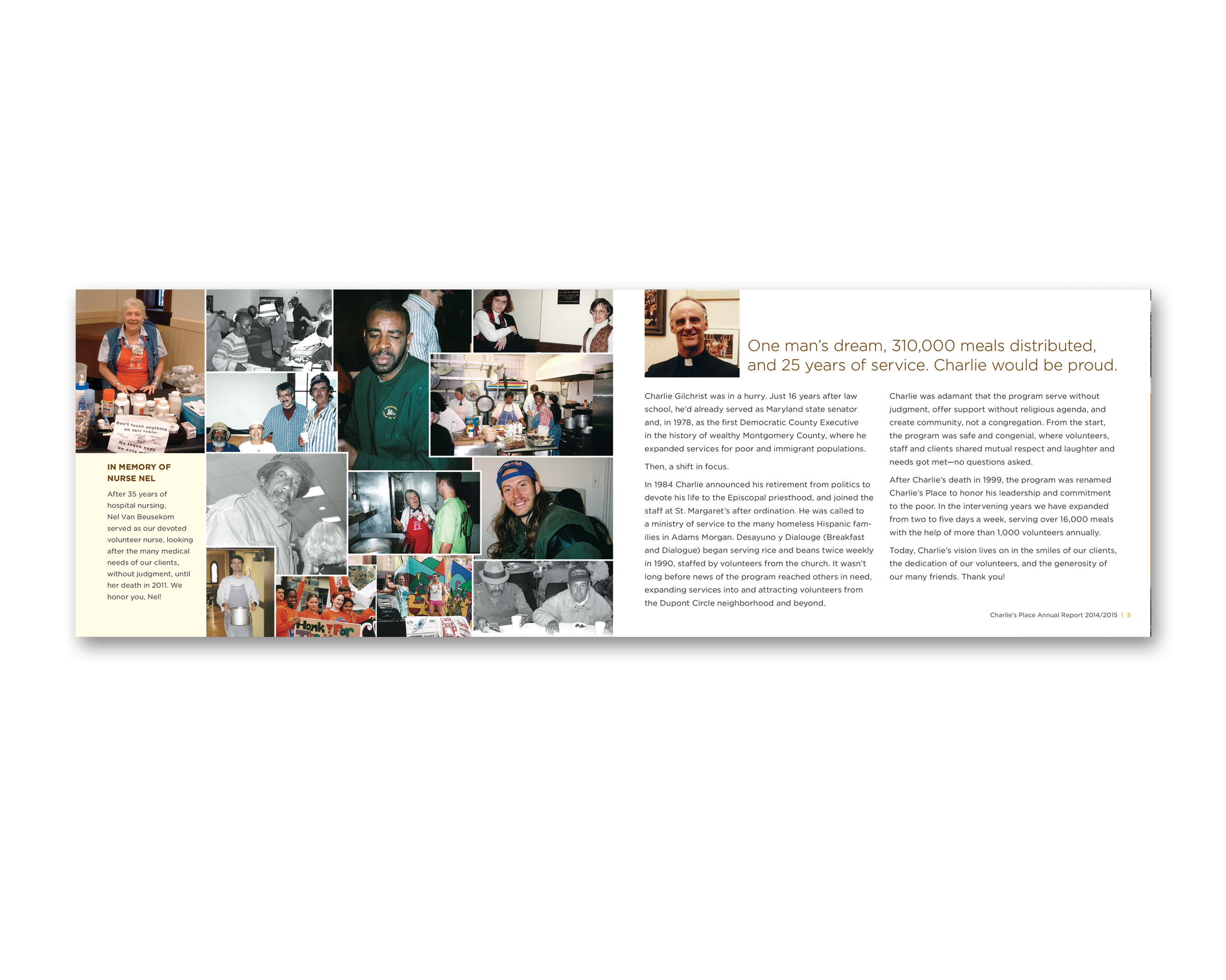
Founded by Rev. Charlie Gilchrist following his retirement as a state senator, Charlie's Place provides meals, healthcare, case management, clothing, haircuts, and community support to Washington, D.C.’s homeless population. What clients described most wasn't the services—it was the feeling of being known. When someone didn't show up, people noticed. Members and staff alike called area hospitals looking for them. That culture of genuine care was the story the annual report needed to tell.
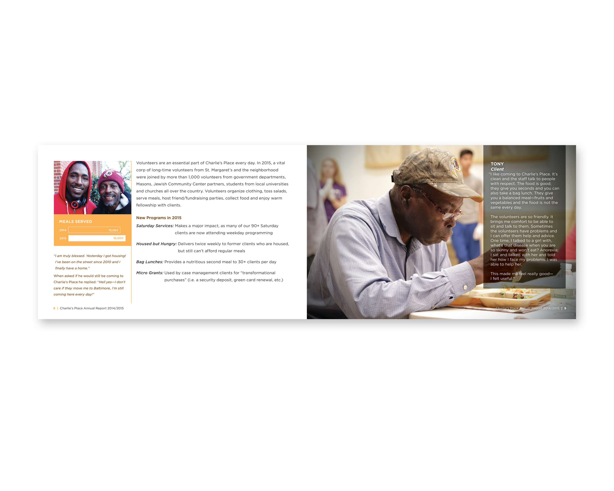
Marking 25 years of service, the report also needed to do something more pointed: encourage greater financial support from the affluent community surrounding St. Margaret’s Episcopal Church in Dupont Circle for expanded programming, including weekend meals, grocery delivery, a second daily meal, and transformational microgrants.
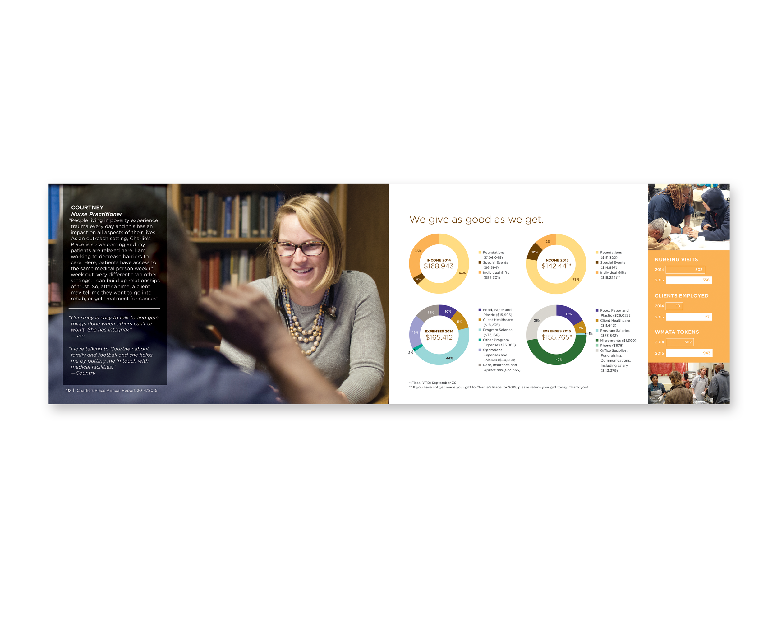
The report centered on a simple, powerful concept: “At Charlie's Place, I am not invisible. I have a name.” Full-page photography shot on site put faces to that idea, pairing images of clients and staff with the established brand palette to create something that felt less like a nonprofit document and more like a human story. Written content was edited throughout to ensure the verbal and visual voices worked as one. Clear, approachable infographics made the organization's reach and impact legible without feeling institutional.
In addition to design, the project included onsite photography and interstitial narrative language developed throughout the report.