When your mission statement goes beyond corporate buzzwords and vague promises of transformation, your identity should too.
CBO Financial was unlike most traditional financial institutions. The organization focused on supporting projects that revitalized distressed neighborhoods, investing in development efforts designed to spark long-term economic and community renewal. But despite the strength of their mission, their voice was so garbled that the impression it left was roughly the equivalent of the teacher from the Peanuts specials: technically speaking, but not actually communicating.
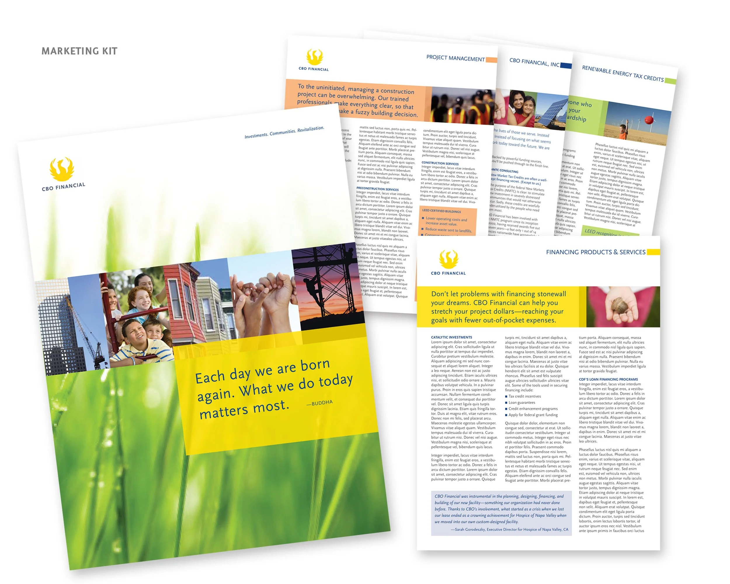
Having garnered $500 million in New Markets Tax Credits, CBO needed to project genuine financial expertise without appearing too corporate or out of touch with the communities they served. At the same time, they needed credibility and trustworthiness with the governmental and financial institutions likely to invest in their programs. Trying to speak to both audiences simultaneously had left them with an outdated identity that wasn't reaching either one.
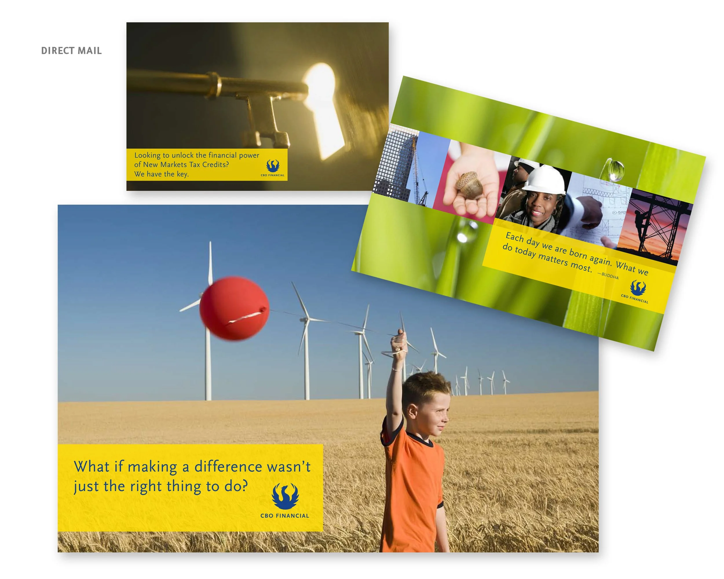
Working alongside CBO’s in-house marketing team, we identified a visual metaphor that reflected both the mission and its measurable, real-world impact: the phoenix. The choice wasn’t decorative. CBO had helped rebuild communities that spent decades in disinvestment and decline, and the phoenix earned its place here.
That idea carried through every piece of the engagement. The campaign headline, “You see challenges. We see possibilities. Your community sees change,” became the through line across a full suite of marketing materials. Even when the words weren't present, the sentiment was. The holiday card featured three warmly lit luminaries, one bearing the CBO phoenix, quietly carrying the brand's promise into a seasonal moment.
The full engagement included brand identity, business papers, marketing kit, direct mail, holiday card, website, newsletter, trade show booth, and presentation materials, all written and designed by Aria Creative.
CBO Financial